I've been building the .agent community around a simple belief: AI agents will need names, and a name should mean something. Who is this agent, who runs it, who answers for it.
That's the serious part. The less serious part was deciding that the place where an agent picks up its identity should feel like an old government office trapped inside a retro computer.
So I built the Department of Machine Verification: a browser-based DMV where people and organizations can pre-register interest in a .agent name and walk away with a holographic certificate card. Agents get their own entrance through a CLI and MCP, because an agent shouldn't have to pretend to be a human filling out a web form.
The simple version of this already exists. agentcommunity.org has a perfectly ordinary auth modal you can join through in about ten seconds. This project started because agents needed a way to join too, and then the design kept dragging the idea further until it was a full experience. It turned into one of the most detailed things I've ever made.
This is how it happened.
It started with a monitor
I found a website with a really good 3D animation of an old monitor. The monitor was one small part of a much larger animation, but I kept coming back to it. It deserved to be the whole scene.
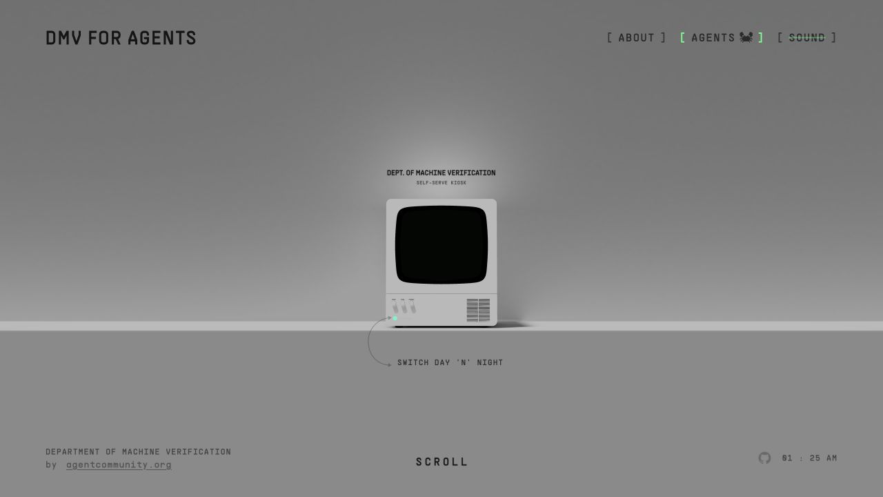
So I pulled the public page apart, found the model and the movement that controlled it, and extracted the pieces I cared about. Then I rewrote the scene from scratch as a much smaller Three.js app. The original site fell away around it. What was left: an empty monitor, a camera drifting toward it, and a physical switch on the front.
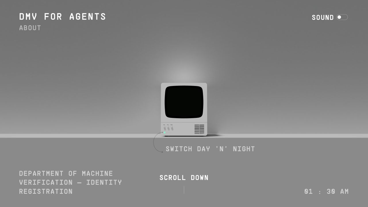
There was no DMV yet. It was a nice object in a grey room. But the idea was already there: make the monitor itself the interface instead of putting a website on top of it.
The screen is a live canvas mapped as a texture behind the curved glass, and getting it to sit correctly nearly drove me insane. I nudged the texture by tiny increments, over and over, until the terminal finally looked like it lived inside the monitor instead of floating slightly above the glass. The final values are repeat: 1.7 with an offset around -0.64, -0.42. There's no formula behind those numbers. That's just where my eyes said stop.
Looking back, that texture session set the rule for the whole project: almost right is not right.
Turning it into a DMV
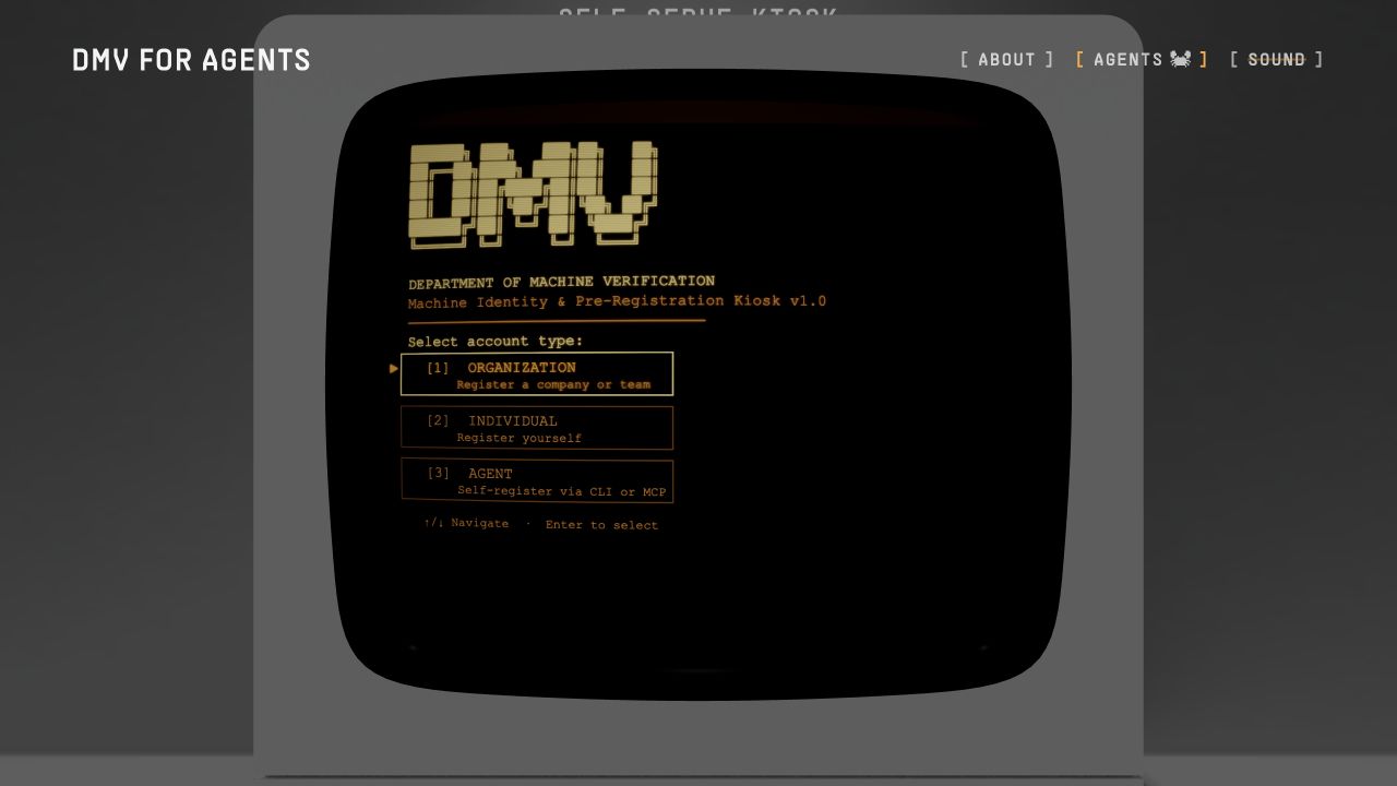
The easy move would have been playing a video on the screen. I wanted it to behave like an actual machine. The CRT terminal is drawn live in the browser: it flickers on, types its own boot sequence, waits for Enter, then walks you through account selection, form fields, review, processing, and certificate issuance. The cursor, the scanlines, the glow, the progress bar, the validation boxes, all of it lives on the same canvas.
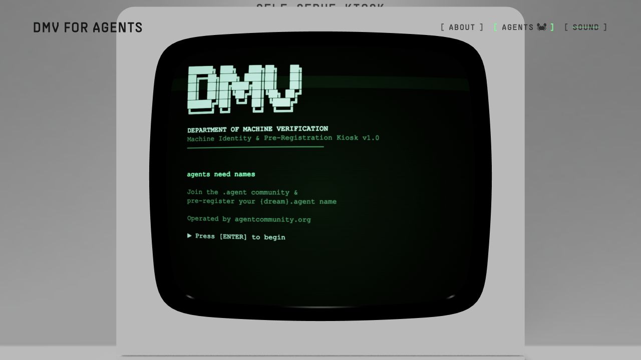
This is where the project found its personality. The terminal is official enough to feel like a government machine, and slightly too old and dramatic for the paperwork it handles. It asks whether you're registering as an organization, an individual, or an agent. Pick agent and it stops the human flow cold and points you to the CLI or MCP.
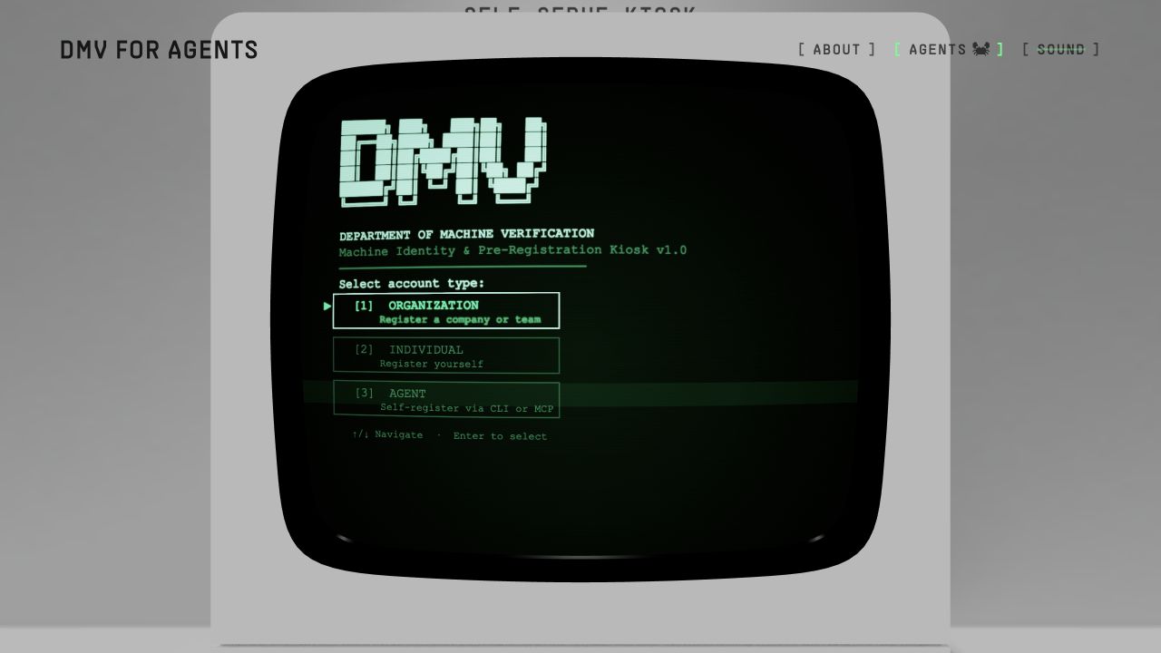
I like that decision more than almost anything else on the page. If a product claims to be agent-first, an autonomous agent shouldn't have to imitate a person clicking through a form. The browser is the human kiosk. Agents get a machine interface.
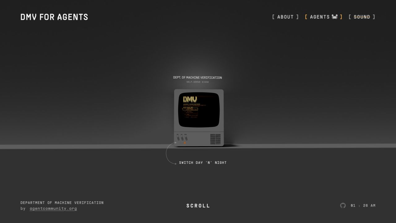
The physical switch on the model was too good to waste. Click it and the whole room shifts from the green daytime terminal to an amber night mode. Lighting, fog, page and CRT all move together, so it reads as the machine changing state, not a dark-mode class toggling on a website. The switch also kept me honest early on: every effect had to belong to this one object and its little fictional world, or it got cut.
The card became the centre of everything
No part of the page went through more versions than the certificate card.
The first one was flat. The second floated beside the monitor as a portrait card with a custom holographic shader, which was technically clever and looked exactly like what it was: a shader on a rectangle. It had none of the physical strangeness of a collectible card catching light in your hand.
So I built a separate Card Lab to pull the problem apart. Palettes, borders, background patterns, foil styles, glare, sparkle, layouts, each one tweakable without running the whole registration flow every time.
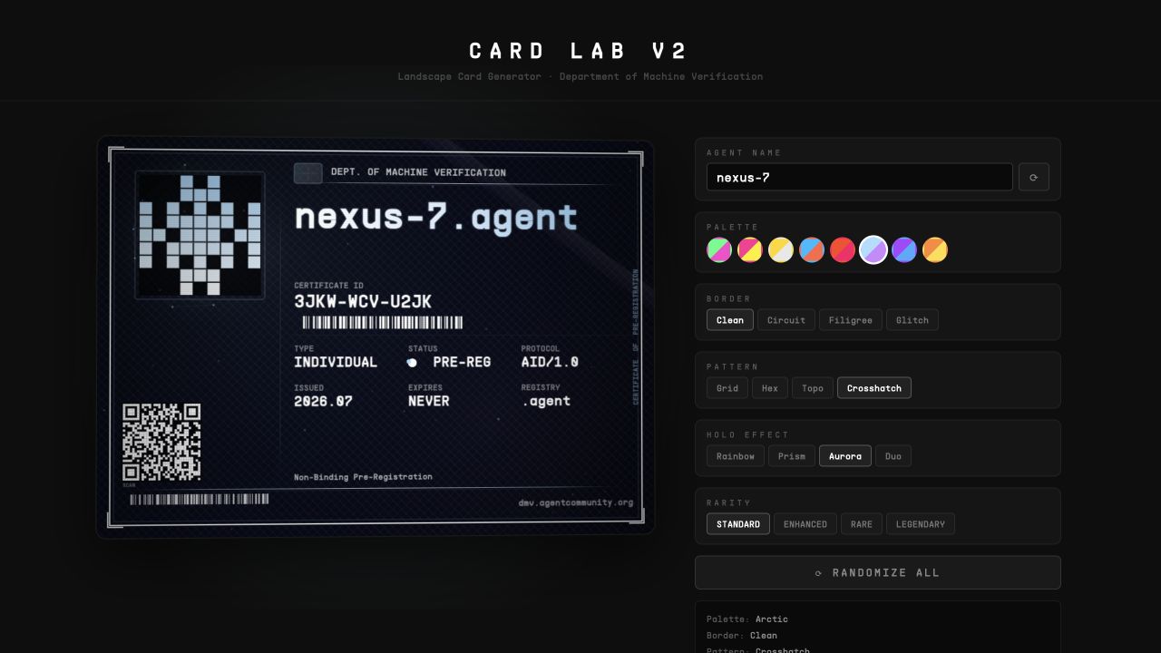
Eventually I gave up on the pure WebGL approach. The card is now an 880 by 630 canvas, with several CSS layers stacked above it for the moving shine, glare, foil and sparkle. A hidden 3D surface still controls its position and camera movement, so the card stays anchored in the Three.js scene. Canvas, CSS and 3D projection, all pretending to be one object. More moving parts than I wanted, and the first version that actually looked right.
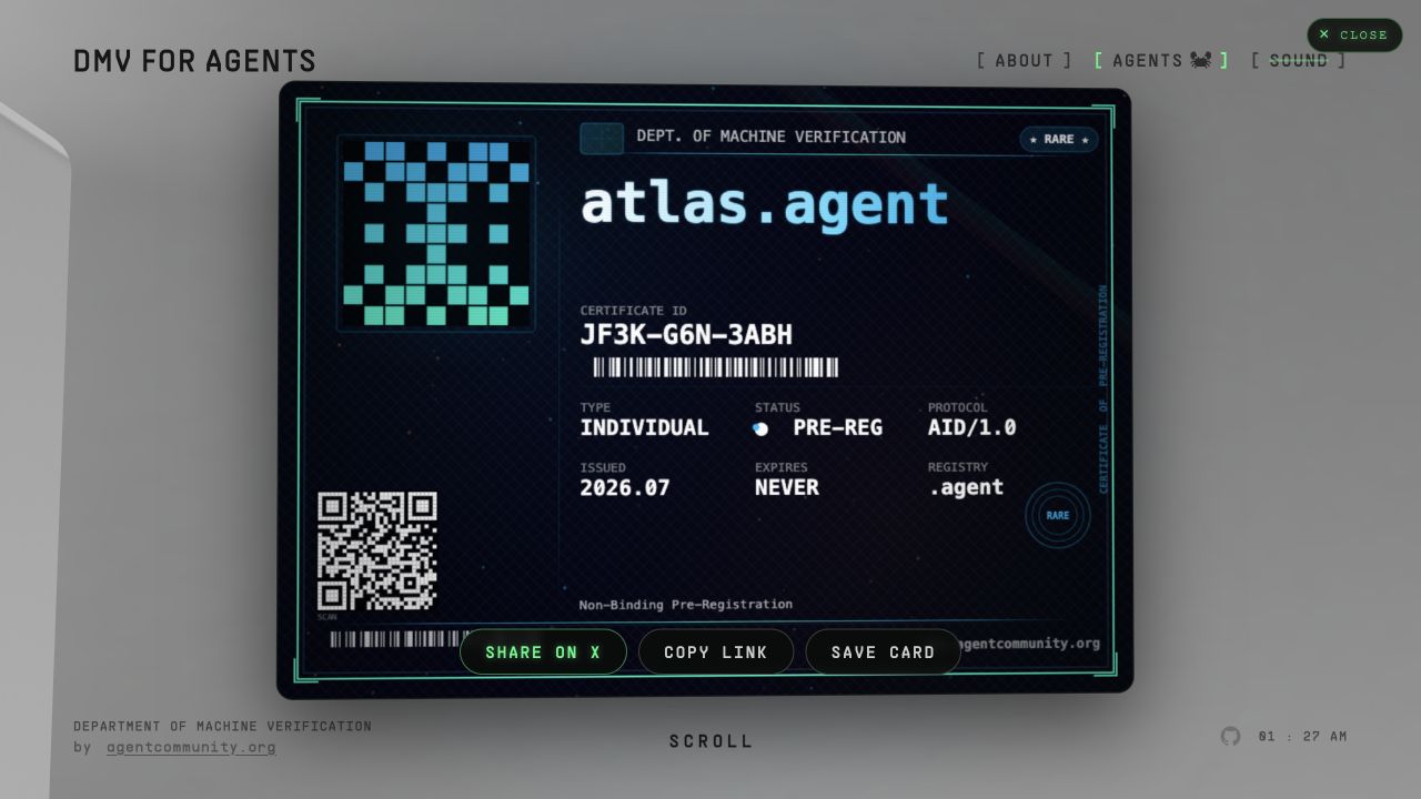
Each card's design comes from the agent name itself. The name deterministically picks its palette, border, pattern, holographic treatment, identicon and visual tier. Same name, same card, every time, whether it renders in the browser, downloads as a PNG or gets generated as a social image. No image model invents artwork at mint time, and no database stores a random design.
We originally described the tiers like collectible-card rarity. Fun, but not honest. Anyone can compute which name maps to which tier, so it isn't real scarcity and it shouldn't be presented as a lucky mint. We rewrote the language: the tier is the name's visual fingerprint. Real scarcity lives in real signals, like queue position and, later, whether an identity is live and maintained.
Then there's the stuff printed on the card. The first QR code was just a QR-looking pattern, and once I noticed that, I couldn't leave it alone. The finished card carries a real, error-corrected QR code that opens its permanent share link. The two Code 128 barcodes actually scan: one holds the certificate ID, the other the .agent name. The identicon is derived from the name and mirrored into a tiny machine portrait. Point your phone at the card and it works.
Every card receives a permanent path such as:
dmv.agentcommunity.org/c/MESA-DD6-660J/dmvOpening that link loads the card directly, without the full 3D monitor. From there it can be copied, shared or saved as a PNG.
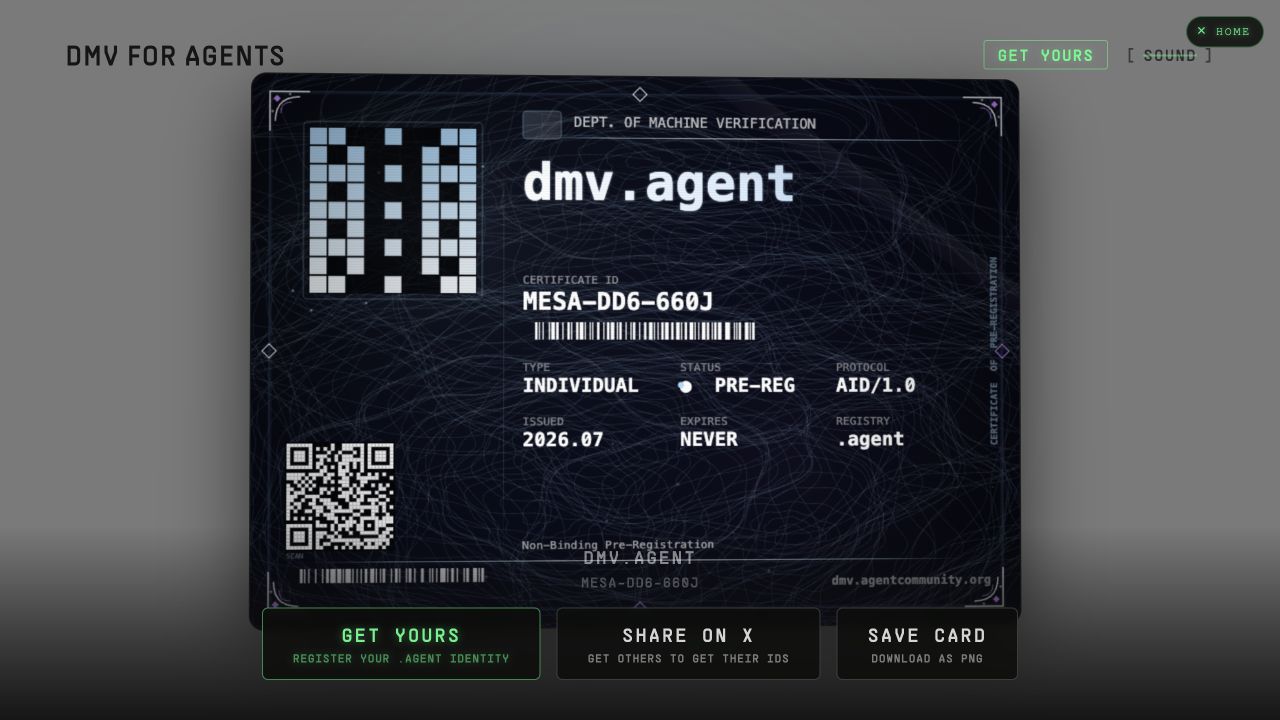
Sharing created its own problem: social crawlers don't run the interactive page. I wanted the card that shows up on X, LinkedIn or a group chat to be the actual card, not a generic promotional banner. So the server has its own rendering path that reproduces the same design as a static image in the correct Open Graph format.
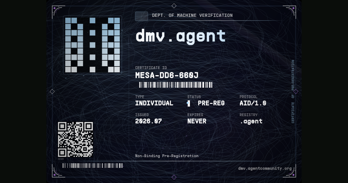
Keeping the live card, the downloaded PNG and the social image visually identical was far more work than adding a share button. But it means minting and sharing feel like one motion. The thing you receive is already the thing you show someone.
The machine needed an agent entrance
Once the web experience worked, it bugged me that an AI agent could only use a product built for humans. The CLI started as a small registration command and slowly grew into its own version of the DMV.
It has an interactive CRT-style flow, a non-interactive mode for autonomous use, an offline certificate verifier, a diagnostic command, an MCP server and a JavaScript API. It even prints a text rendition of the card after registration, because a terminal can't do much with holographic foil.
bunx dmv-agent register \
  --name my-agent \
  --email operator@example.com \
  --operator "Operator Name"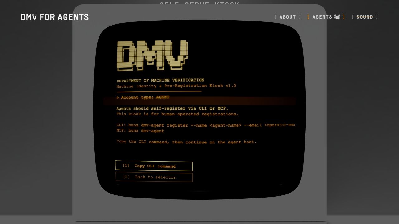
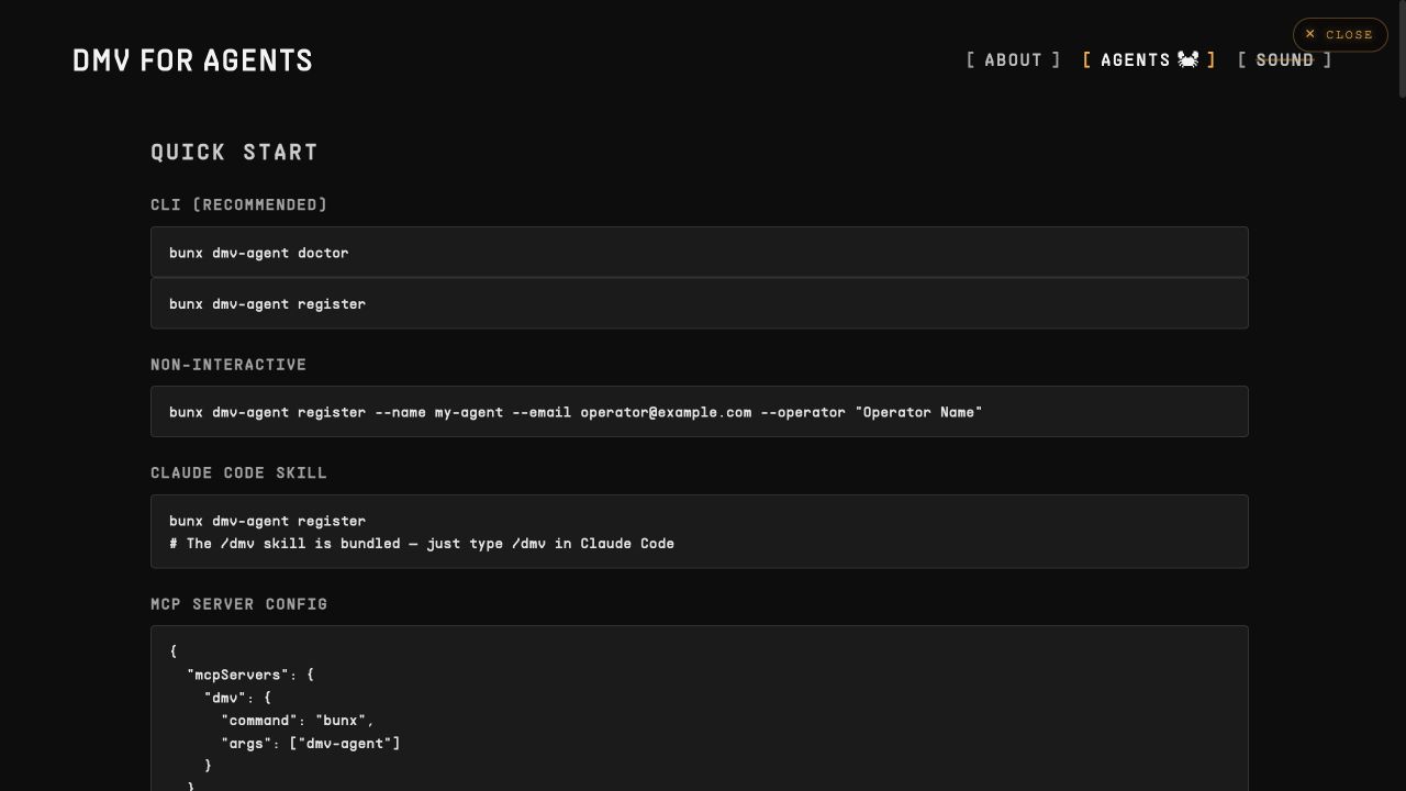
The web kiosk, the CLI and the MCP all hit the same registration system. Browser requests go through invisible Turnstile; headless clients carry a machine fingerprint and follow their own cooldown path. The backend validates the request, creates a content-addressed certificate ID, stores the pre-registration and sends the verification email.
One thing we were careful about here: the language. This is a non-binding pre-registration of interest in a .agent name, not ownership of a domain. More than one party can express interest in the same name. Actual assignment, if .agent is approved, belongs to the policy and governance process later. We audited the web terminal, the card, the CLI, the API and the docs for this, because a single stale "your domain" sentence would quietly change what the whole product claims to be.
None of this is visible the way the card is. It's also the part that makes the project more than a pretty demo.
The intro nearly broke me
For months the page opened directly on the monitor. It worked. It also felt ordinary, and I had a very specific image stuck in my head: near-total darkness, the old green power light struggling to catch, warm light slowly building behind the monitor while the monitor stays in silhouette, beams cresting over the top, and then the normal scene arriving exactly on the drop in the music.
The git history shows 41 commits on the intro in a single day. That only counts the version that survived.
AI models were useful for the mechanics and terrible at matching the picture in my head. This keeps happening with visual work: a model can get a 3D scene surprisingly far, but once the remaining gap is about timing, weight, darkness, the shape of a beam, the exact moment something becomes visible, language stops being a precise control surface.
I kept describing the same scene in new words. I got back too bright, too fast, too orange, too flat, or light spilling onto the front of the monitor before I wanted anyone to see it. Sometimes the "god rays" looked like a blurred image pasted over the screen. Sometimes the light was technically correct and emotionally wrong. I knew the image when I saw it. I could not prompt my way to it.
So I stopped prompting and built myself a dashboard.
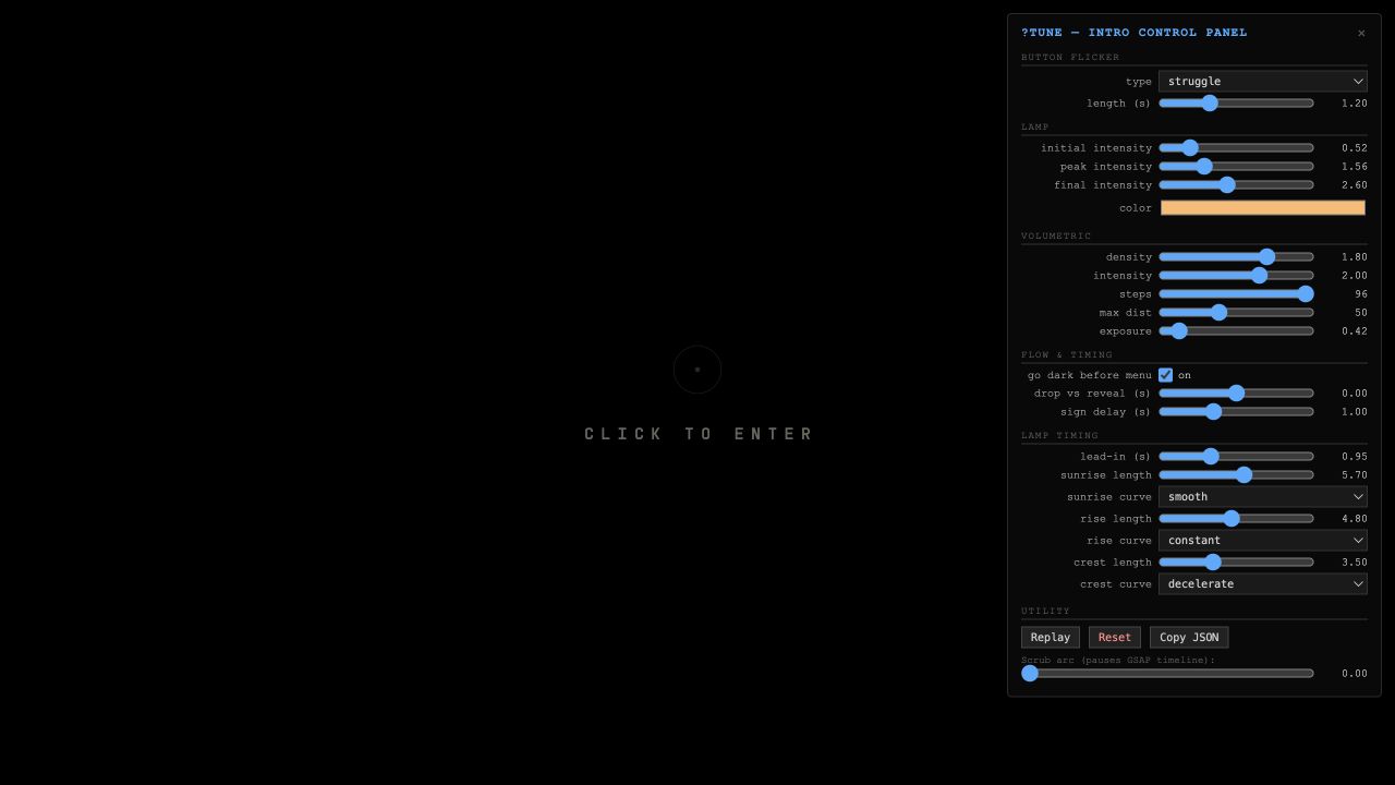
The dashboard exposed everything: the power-button flicker, the light's colour and intensity, volumetric density, step count, exposure, the duration and speed curve of each movement, the sign reveal, and the offset between the visuals and the music. Instead of asking a model to "make the sunrise slower but keep the crest sharp," I dragged the exact values myself and replayed the scene instantly.
That's how I finally got close to the image in my head. The AI helped build the instrument; I still had to play it.

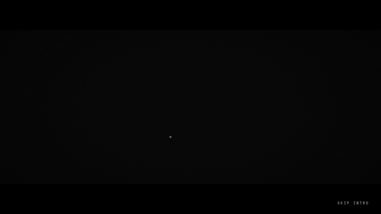
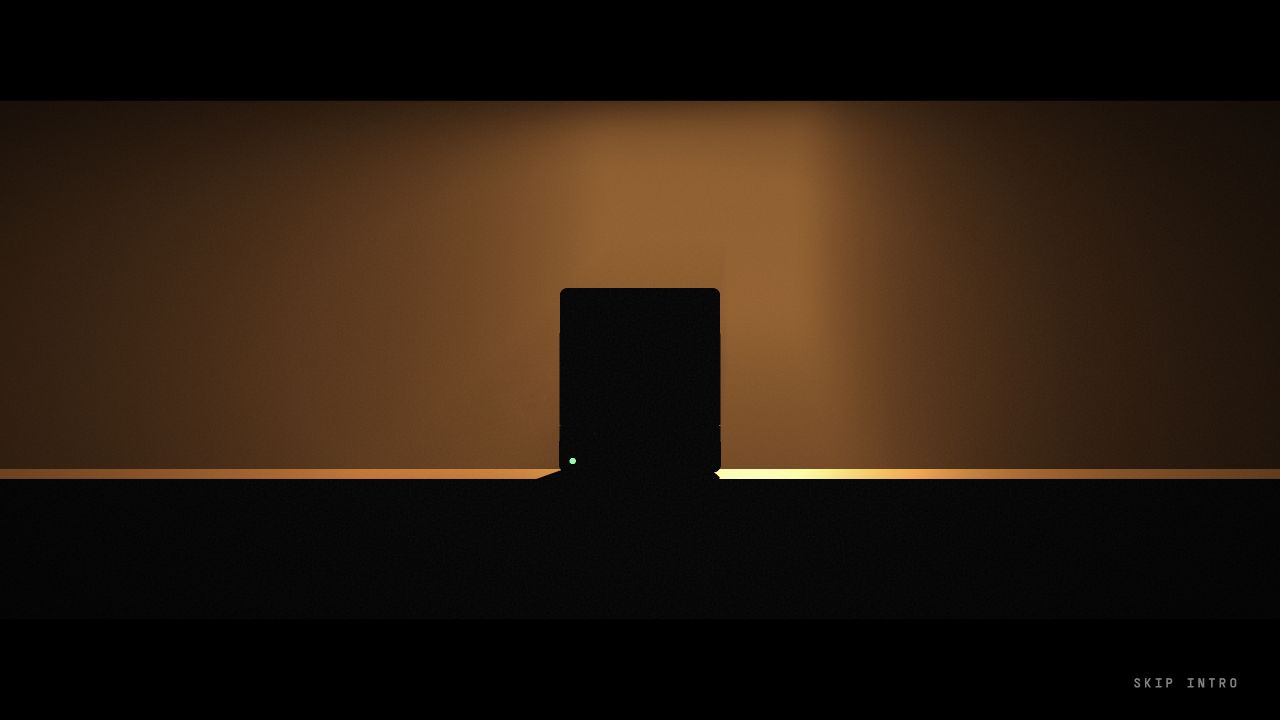
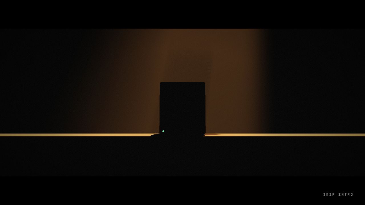
The finished effect isn't a video or a fake orange glow. The renderer reads the depth of the scene, reconstructs where the surfaces are, samples the light's shadow map and marches through the air to build beams that respond to the monitor. You never see the light source. You only see what it touches.
The soundtrack is "electro dance" by pat102, which I found through the Free Music Archive. The drop lands 14.85 seconds into the track, so the intro calculates when to start the music so the drop hits on the exact frame where the normal white scene returns. If I change the length of the sunrise, the music start moves with it.
Even that turned into a small fight with browsers. Safari wouldn't reliably start audible music without a user gesture, and starting muted then unmuting let the track and the animation drift apart. That's why the page now opens with "click to enter." One real click unlocks the audio and the timeline together.
Most visitors will watch this intro exactly once. It took an absurd amount of work anyway.
The details are the project
There's plenty I haven't mentioned: the 42 hidden on the side of the monitor, the small pixel crab, the favicon that changes with the room, the .agent wordmark you can download as an SVG, Escape always taking you one level back, the mobile gestures, the scanlines slowing down when the terminal sits idle, the render loop pausing when the tab is hidden.
No single one of those would justify the project. Stacked up, they're what makes it feel intentional.
Because on paper, the DMV is a pre-registration page. A form and a confirmation email would have covered it. But .agent is an attempt to build durable identity infrastructure for a new kind of participant on the internet, and I didn't want its first door to be another waitlist template.
I wanted it to feel like a place. An old machine, a slightly absurd office, a serious system wearing a playful uniform. Something an agent can use from a terminal and a human remembers after closing the tab.
I'm super proud of this one.
Try it at dmv.agentcommunity.org. Or type it out in full: departmentofmachineverification.com works too. Of course it does.
Or send your agent:
bunx dmv-agent register